Most articles about interactive master plans describe them in the abstract. This one shows a real project experience, screen by screen, using our demo development — so you can judge what "interactive" actually means when a buyer has it in their hands. If you're comparing vendors, this is also a concrete benchmark: the feature checklist in visual form.
The journey below runs master plan → building → floor → unit → enquiry. Every screenshot is the live product, not a mockup.
The master plan: orientation, amenities, and the way in
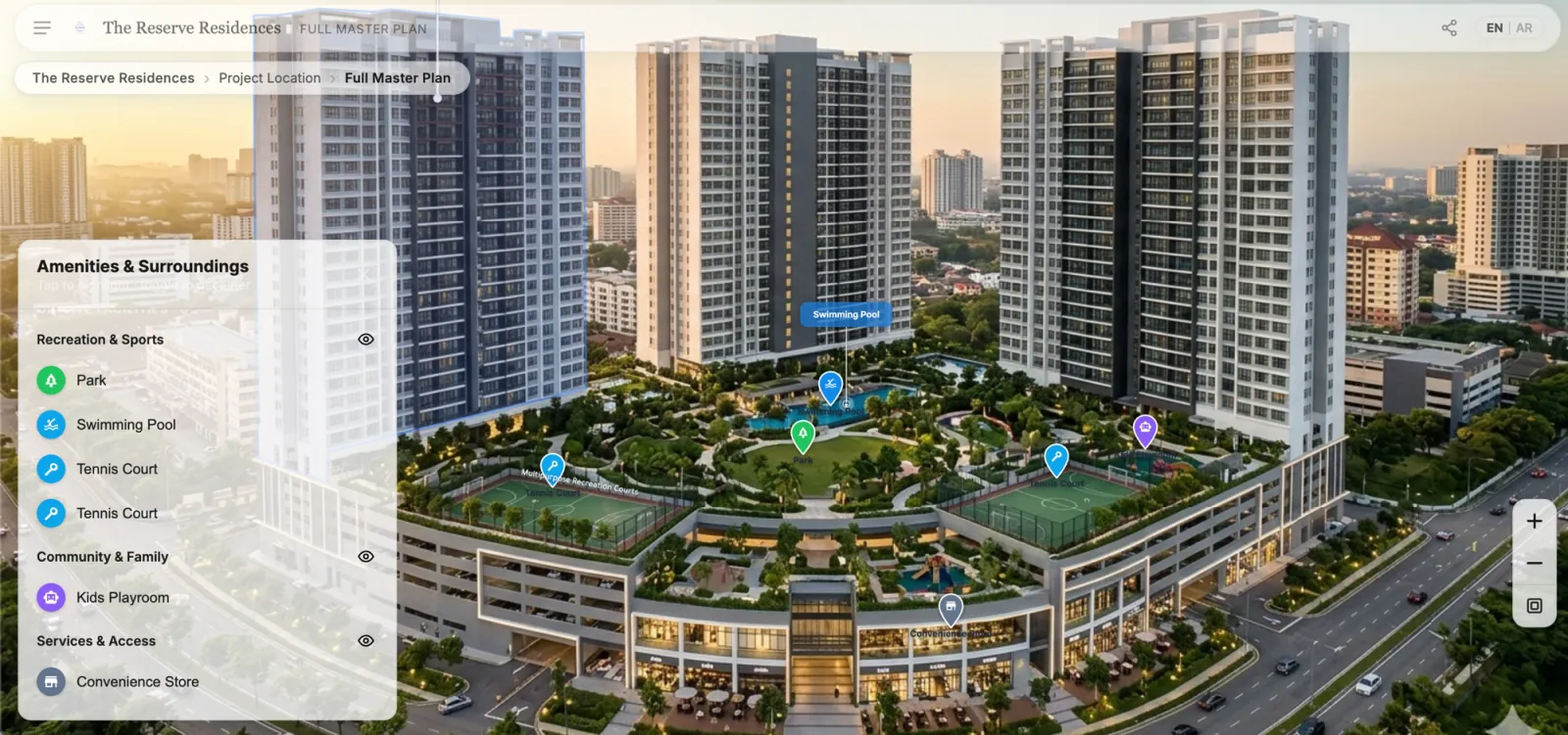
The buyer's first screen is the development itself — a real aerial made navigable. Towers highlight as the cursor moves, and the amenities panel toggles categories of points of interest on and off: recreation and sports, community and family, services and access. "How far is the pool from my tower?" stops being a question for the sales team.
 Live demoExplore the master plan yourselfopens the interactive RegalScene demo in a new tab
Every pin and highlight is also a doorway: clicking a tower enters it. That's the difference between an annotated image and a navigation layer.
The building view: filtering on the visual, not in a list
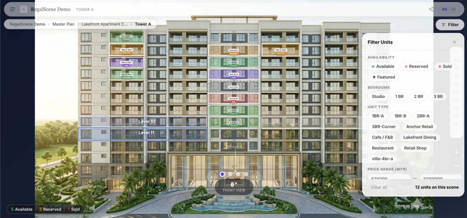
A buyer arrives at Tower A from the master plan. Every mapped unit carries its current status — green available, amber reserved, violet held, red sold — and the filter panel works on the building: availability, bedrooms, unit type, price range, floor range, even featured units.
 Live demoTry the live filters on the buildingopens the interactive RegalScene demo in a new tab
The critical detail: filtering doesn't produce a text list. Matching units stay lit on the facade while the rest fade back — the buyer shortlists visually, in place. The result count ("12 units on this view") keeps the state honest, and one tap clears it.
360 angles: the same building, every side
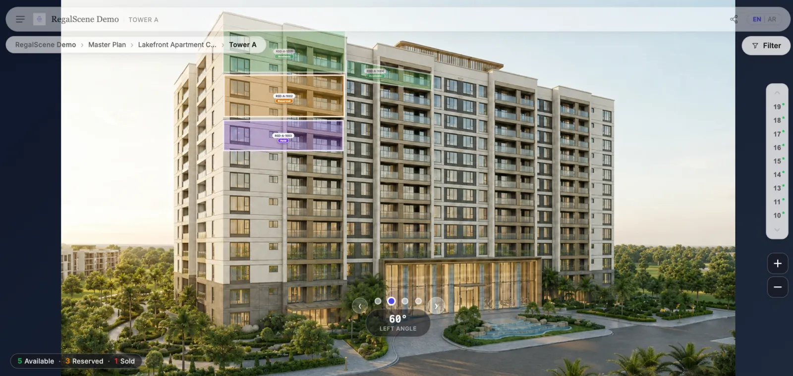
The front view never answers "what does my unit face?" The building rotates through its angles — front, 60° left, and beyond — with the unit overlays staying mapped to the facade at every angle.
 Live demoRotate the building in the live demoopens the interactive RegalScene demo in a new tab
This is rendered from the same CGI package the project already commissioned for its brochure — the render budget doing double duty.
The floor plan: availability where layout decisions happen
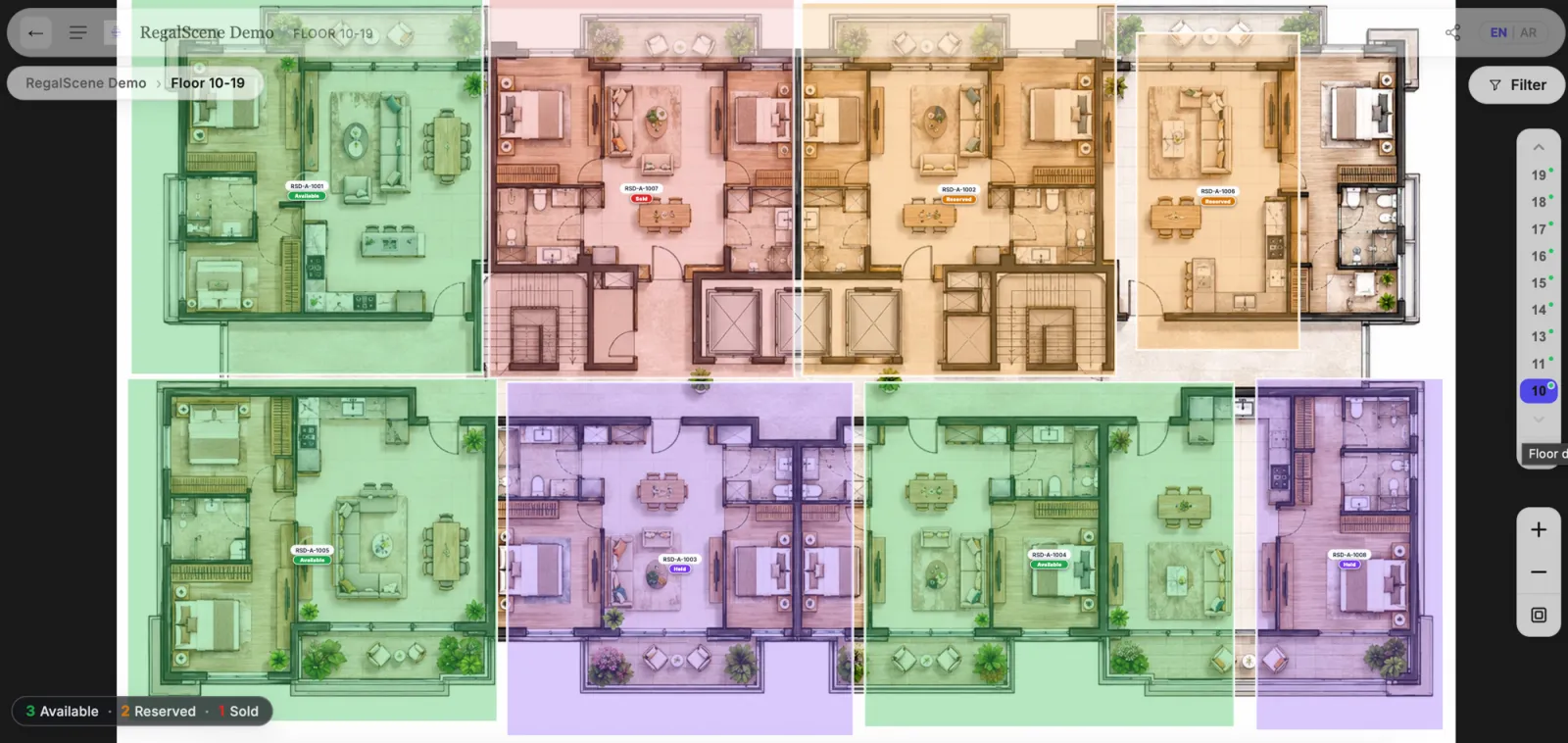
One level deeper, the floor plan shows every unit's layout and status together. The floor rail on the right jumps between levels — with availability dots per floor — so "is there a corner unit free higher up?" takes two taps to answer.
 Live demoExplore floors and availability liveopens the interactive RegalScene demo in a new tab
The unit card: from interest to action in one tap
Tap an available unit anywhere in the journey and the card appears in place: type, size, price, and the actions that matter — register interest, request a callback, WhatsApp.
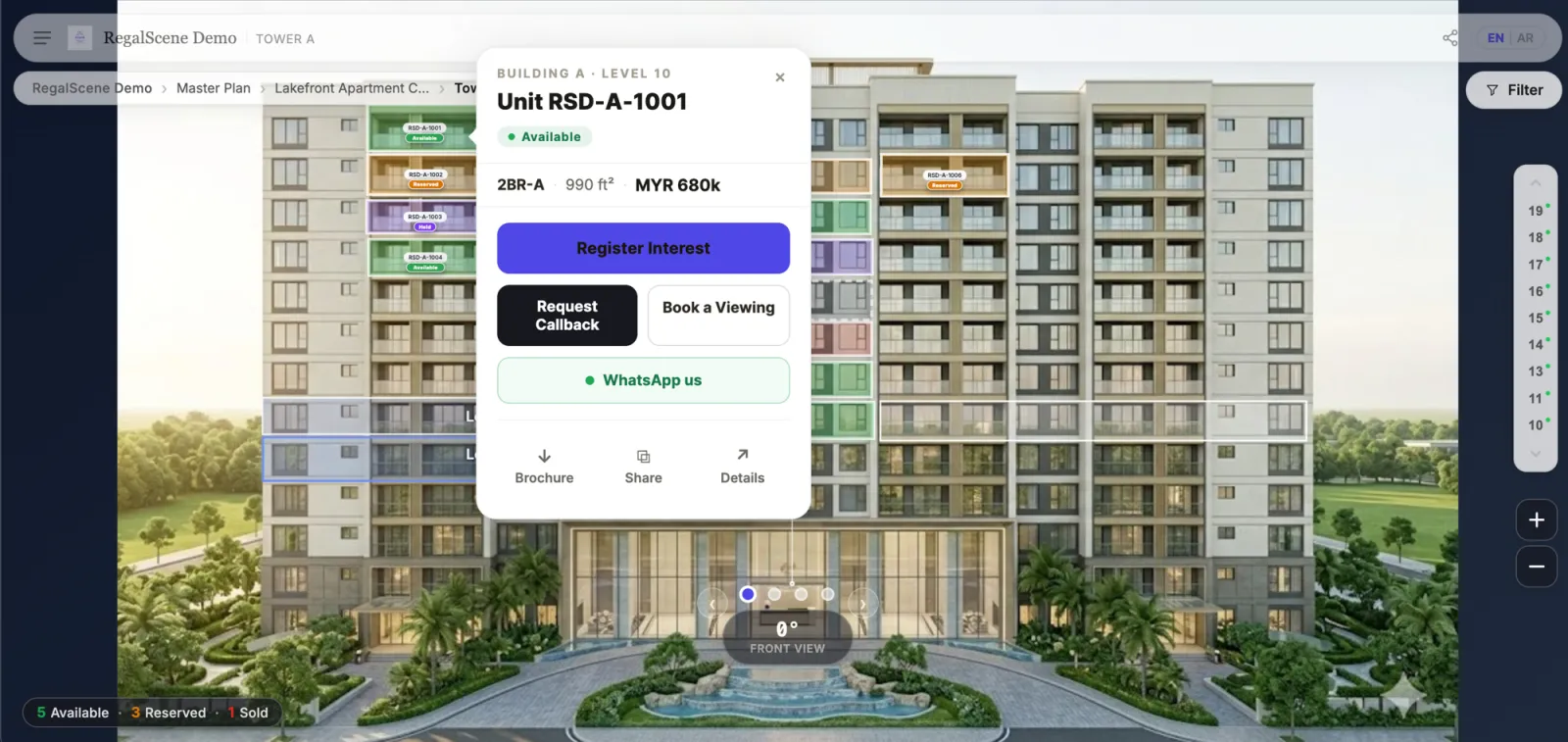 Live demoOpen a live unit and its actionsopens the interactive RegalScene demo in a new tab
This is where interactivity converts. The enquiry doesn't say "someone filled a form" — it says this buyer, this unit, this view, this source. Sales calls start as follow-ups.
The detail panel: everything a serious buyer checks
For buyers past the browsing stage, the full panel: indicative price with per-square-meter rate, bedrooms, bathrooms, area in both units, brochure download, viewing booking — and side-by-side comparison for shortlisting up to four units.
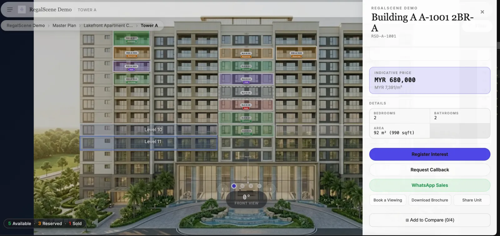 Live demoSee a full unit detail panel liveopens the interactive RegalScene demo in a new tab
Price visibility here is the developer's setting, not the platform's: show exact prices, ranges, or price-on-request per project or per unit type.
Sharing: the experience travels
Every level — project, floor, individual unit — shares as a link: QR code for hoardings and events, WhatsApp for the conversation buyers are already having, copy-link for everything else. The person who receives it lands exactly where the sender was standing.
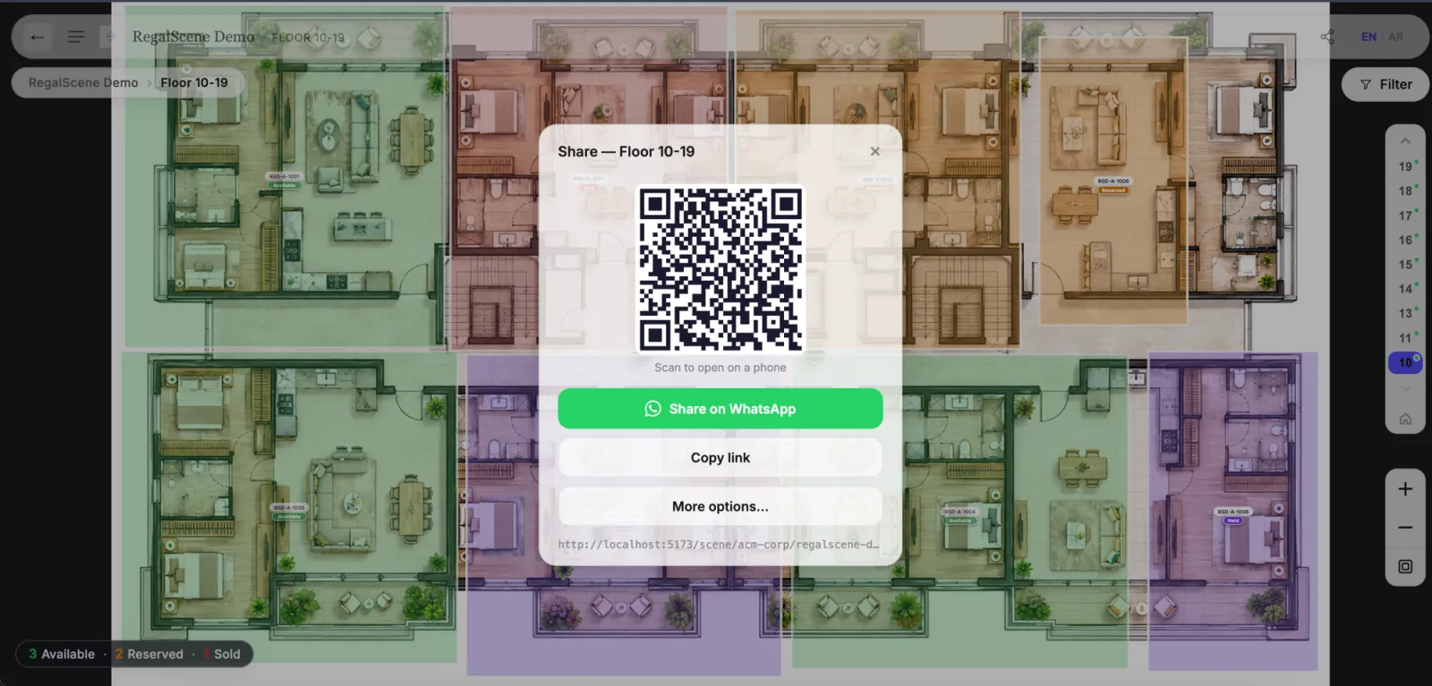
A buyer sending "this one?" to a spouse is the highest-intent referral in real estate. Static brochures can't do it; a navigable link does it natively.
What to take from this anatomy
Three things separate this from a clickable render, and they're all invisible in a static screenshot of someone else's demo reel:
- The data is live. Every status badge, count, and price comes from the project's inventory — when a unit sells, every level of the experience already knows.
- Every level is an entry point. QR codes and shared links land buyers mid-journey, and the navigation carries them anywhere from there.
- Every interaction is measurable. Which floors get explored, which units get compared, where buyers drop off — the demand intelligence benefit rides for free.
If you're evaluating platforms, ask every vendor to walk this exact journey in their live product — filters, current status, enquiry context, sharing. The gap between a demo video and a working system shows up within the first three clicks.
Every screen above came from a browser-based interactive master plan running on ordinary hardware, with no download and no dedicated app.
Related reading:
- Interactive Master Plan Software for Property Developers
- Interactive Master Plans for Townships and Mixed-Use Developments
- Interactive Master Plan Features: A Developer's Checklist
- Interactive Master Plan Benefits: What Property Developers Actually Gain
- Interactive Property Map for Real Estate Developers: The Complete Guide
- How Much Does an Interactive Master Plan Cost?
- How Massive Master Plans Stay Fast in a Normal Browser
The screens above are RegalScene — one platform from master plan to unit enquiry, built from the renders you already have. Book a demo and walk the journey yourself.