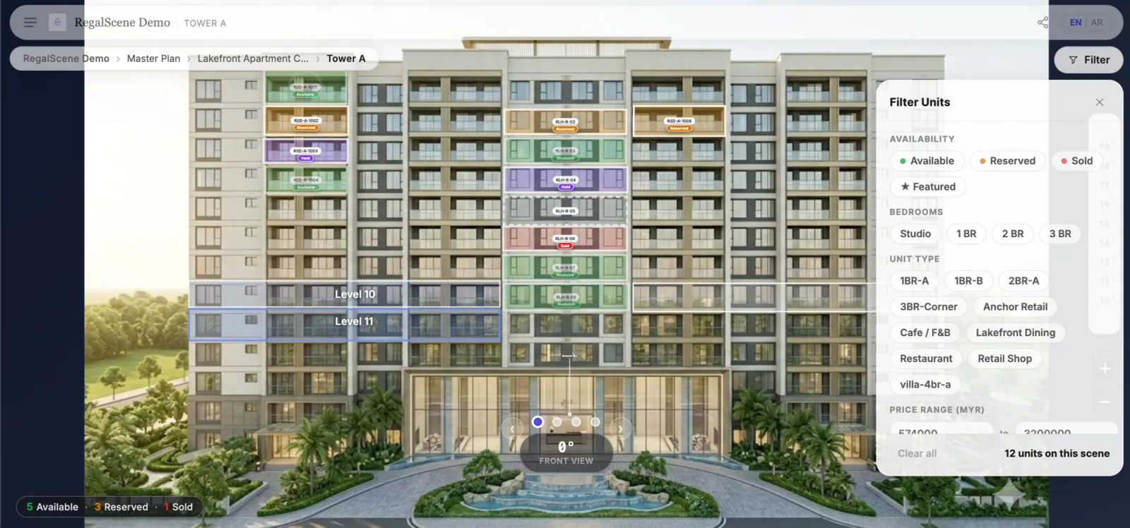
Feature lists for interactive master plan applications tend to read like a rendering studio's showreel: rotatable views, day-and-night modes, cinematic flythroughs. Those demo beautifully in a pitch meeting. But when you look at what actually moves buyers from exploring to enquiring, a different set of features does the work — and several of the most important ones never appear in a demo at all.
Here's the checklist we'd use to evaluate any interactive masterplan (or master plan), grouped by the job each feature does. It is one part of a three-part guide: how to choose interactive masterplan software covers the decision process, and the four types compared explains the kinds of product on the market.
Navigation features — can buyers find their way to a unit?
Full project hierarchy. The master plan should be the top of a journey, not the whole journey: development → zone → building → floor → unit, each level clickable, with a way back. If the "master plan" is one clickable image with popups, buyers hit a dead end exactly when they're most interested.
Deep zoom that stays sharp. Your aerial render is large; buyers explore it on phones. Tile-based deep zoom (the technology behind map apps) keeps pan and zoom smooth and crisp at every level — a single stretched image doesn't.
Hover and tap states that communicate. Zones and buildings should show what they are and what they hold before the click — names, unit counts, availability summaries. Every unlabeled shape is a question the buyer won't ask.
Wayfinding for the lost. Breadcrumbs, a project menu, an obvious way home. Buyers arrive from QR codes and shared links directly into deep levels; they need to orient from anywhere.
Data features — is what buyers see true?
Current unit availability. The non-negotiable. Status should come from your current inventory — available, reserved, sold — not from colors baked into the artwork. Ask the vendor directly: when a unit sells, what exactly has to happen for the map to reflect it? The right answer is measured in minutes and involves no one from the vendor's side.
Unit detail on tap. Type, size, floor, orientation — and price, if and when you choose to show it. Price visibility should be your setting (show, hide, on-request), not a hard-coded fact of the tool.
Filtering that matches how buyers think. Availability, bedrooms, tower, floor range — applied visually, so matching units light up and the rest recede. A filter that returns a text list has left the visual experience behind.
Conversion features — does exploration become pipeline?
Enquiry in context. The lead should carry what the buyer was looking at — project, building, unit, whether they saw the price. This is the single highest-leverage feature in the entire checklist: it changes every sales conversation that follows.
The channels your buyers actually use. In Southeast Asia and the Gulf that means WhatsApp and phone alongside forms. An enquiry button that only opens email is a leak.
Shareable everything. A buyer who can send this exact unit to a spouse via a link is doing your marketing for you. Share links and QR codes should work at every level, not just the front page.
Operational features — the ones that decide the total cost
These never show up in demos, and they matter more than anything above after month one:
Self-service updates with controlled publishing. New phase, price change, updated render — your team edits, reviews, and publishes. Buyers should only ever see a stable published version, never work in progress. If changes go through the vendor, multiply the quoted price by the life of the project.
Embed and distribution control. The experience should embed in your website and campaign pages, and — if you sell through agencies — support agency-specific versions with your rules about pricing visibility and lead attribution intact.
Analytics you can act on. Which zones get explored, which units get compared, where buyers stall and drop off. This is how a master plan pays for itself twice — once in leads, once in demand intelligence.
Life after sell-out. Ask what happens when the project sells out. The good answer: the same experience keeps working for resale and leasing. The common answer: it retires with the campaign.
Features that demo well but rarely sell units
In the interest of honesty: day/night toggles, cinematic flythroughs, and photoreal seasonal variations are lovely, and none of them answers a buyer's actual questions — what's available, what does it cost, how do I ask? If a budget forces a choice, choose the boring features above. Immersive layers like 360 building views earn their place after navigation and data are solid, as our comparison of virtual tours, renders, and master plans covers in depth.
The one-line test
If you remember nothing else from this checklist, ask each vendor one question: "Show me what a buyer sees the moment after a unit sells." The answer tells you whether you're buying a picture or a sales system.
RegalScene answers this checklist line by line on the RegalScene interactive master plan page, including the categories the product is deliberately not in.
Related reading:
- How to Choose Interactive Masterplan Software (2026)
- Interactive Masterplan Software Compared: 4 Types
- Interactive master plan software: how it works
- Interactive Master Plan Example: Anatomy of a Real Project, Screen by Screen
- Launch an Interactive Property Experience Without Building Custom Software
- Interactive Master Plan Benefits: What Property Developers Actually Gain
- What Is an Interactive Master Plan?
- Site Plan vs Master Plan vs Property Map
- How Much Does an Interactive Master Plan Cost?
- Best Virtual Tour Software for Property Developers in 2026: How to Choose
RegalScene covers this checklist end to end: deep-zoom navigation, current availability, contextual leads, controlled publishing, embeds, and analytics — built from the renders you already have. Book a demo.